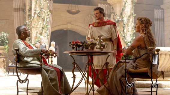
Celebrating The Title Sequence
The art of opening titles seems to be a bit of a dying art these days, particularly with the current craze – both in and out of Hollywood – for sticking movie titles at the end of films. Recent releases like Inception, Sherlock Holmes, Avatar and others now simply starting without so much as a nod or a wink to what you’re actually watching, some fear that an appreciation is being lost for the value of the humble opening titles sequence.
Some may feel that title sequences are artifacts from a bygone age, the 20th Century as it were, in filmmaking, but many filmmakers steadfastly adhere to the humbling importance of title sequences as an integral part of the ritual of cinema and not to be dismissed so easy, despite corporate Hollywood’s supposed ‘can’t-give-a-fuck’ attitude towards the appreciation of the artform.
Walk with me now as we take a very, very brief and small look at the world of movie title sequences and what makes them important, relevant and classic.
The origin of movie titles sequences is actually both a legal and functional carry-over (like many things in the movies) from 19th Century theater. For reasons of copyright, it was important that films either open or close with title cards that display the name of the play (and now film), the production company creating the performance (now also film) and, as the culture of ‘stars’ emerged in the theater, the names of the players performing the roles in order to attract and build audiences. As directors like D.W. Griffith and Charlie Chaplin rose to fame in the early years of silent cinema, the roles of producers and directors began appearing in film credits as well as an extra incentive, essentially creating star-billing for non-actor roles.

Main title card for "The Gold Rush" (1925)
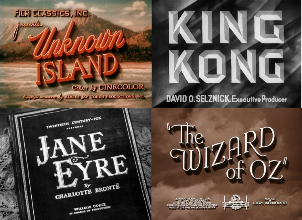
Slowly, but surely, title cards began to acquire their own sense of sophistication. Just like their theatrical counterparts, the title cards for films began to slowly become more ornate, complex and atmospheric – often accompanied by overture music (unusual since movies didn’t incorporate background music until much later, around the 1930’s). Apart from flourishes and carefully designed fonts, titles began to also incorporate thematic, mood-setting, backgrounds and artwork. Take the examples below from the ‘full-color’ spread and artwork in Unknown Island, the live-action storybook cards for Jane Eyre (a technique which Disney actually utilized for their own films), the art-deco modernism of King Kong that subtly hints the cutting-edge quality that the movie held at the time or the ethereal clouds of The Wizard Of Oz which foreshadows the thematic ideas of dreams, flight and bad meteorological phenomena.
Of course these revolutions were pretty minor all up, as there was still a very strong distinction between the credits and the film, separated by a no man’s land of story context (known as diegesis) that forbade one from spilling out into the other. Even when title sequences began to drop off the hard-crafted ‘cards’ for live-action backgrounds (like here in this ahead-of-its-time credit sequence for Universal’s classic monster movie The Wolf Man), the titles were a thing to be ‘gotten out of the way’ before a film started. This was particularly important because, prior to the 1960’s, films rarely had end-credits and would get all of the films credits out of the way at the start. It wasn’t until the growing power of film unions demanded that film technicians, extras and crews were to be credited did studios realize that they needed to list these at the end where audiences could leave the theater early rather than sit through 2-3 minutes of names of people they didn’t know or care about.
It’s difficult to place which film was the first to super-impose credits over live action sequences or scenes from a film (like this famous sequence from the classic film The Graduate) though Hollywood was experimenting with the mixture of titles with live action sequences in films like My Darling Clementine (1946) and The Cat & The Fiddle (1933). Gradually, between the mid-1950’s to the late 1960’s, the practice of shifting titles from separated, often designed and atmospherically executed, sequences to the time-and-cost-saving technique of placing them directly over the opening scenes of the film (e.g. this fairly low-key, but famous opening to the blaxploitation classic Shaft) was in full-effect. It wouldn’t be until the invention of the summer blockbuster that title sequences came back into the foray, though early blockbusters like Jaws and Raiders of the Lost Ark still had the simple text-over-the-opening-sequence techniques.
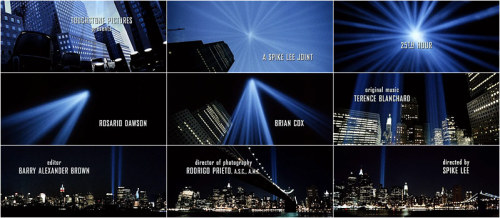
Contact sheet from the titles of Spike Lee's "25th Hour"
Today, the subject of titles is as varied and argued as ever, especially with the advent of films that simply ignore opening titles altogether and leave them all for the very end; some producers and directors suggesting that they are ‘irrelevant’ in the world of modern cinema. Countering to this opinion, producer and director Tim Burton mentions on the DVD commentaries of his films Batman and Batman Returns that opening titles more than just a function of paying lip-service to people or a legal formality, but they are part of the ritual of cinema and an important part of the experience of watching a film. Burton, who is famous for his opening titles which often feature a wandering camera through a thematic environment linked with the film (e.g. a Bat-symbol sculpture, Willy Wonka’s chocolate factory or Sweeny Todd’s London), says that opening titles allow an audience to ‘settle’ and to subconsciously begin to ‘tune in’ to the world, themes and atmosphere of the movie that they’re about to witness. To not include this vital part can be a jarring experience for an audience and puts more pressure on the filmmaker to suck an audience in with a whizz-bang scene rather than letting the paying punter meet you halfway by being lulled into the movie before the drama kicks off.
Since Burton’s citing the titles for his Batman films as an example, let’s do a quick comparison starting with the titles for the famous 1940’s Batman serials:
So far pretty uninteresting; this title sequence in fact looks almost card-for-card identical to the 1933 title cards for Tod Browning’s Dracula starring Bela Lugosi. Then of course we graduate to the famous 1960’s Adam West and Burt Ward television show and subsequent feature film.
Alright, so not particularly inspiring, but very 1960’s in execution; combining the camp-craze with live-action pop-art, psychedelia and a slightly more serious version of the famous surf-music Batman theme song that everyone still knows today. Then along comes Burton in 1989 with his groundbreaking take on the superhero which, almost single-handedly, kicked off the comic-book-movie craze we’re experiencing today:
And for extra mileage – as a credit sequence that very cleverly incorporated into its opening scene – we can also take a look at Burton’s dark and kooky sequel Batman Returns. These various opening sequences and their graduating complexity and artistic expression make for interesting contrast against the opening sequences of Christopher Nolan’s Batman Begins and The Dark Knight which don’t feature titles at all, just CG-animated 10-second logos of the ‘bat-symbol’ before plunging straight into the film at full pace.

Sped-up opening graphics from "The Dark Knight"
For my part, I completely agree with Burton and I think that a top-notch title sequence can not only help an audience get in sync with your film, but also removes the pressure of having to dramatically suck in your audience from the very first frame. Title sequences that do end up in modern films tend to be extremely elaborate and expensive, but many are notable as singular works of art in of themselves and sometimes burn deeper into the minds of an audience than the film that ante-cedes it.
Let’s look at some examples of great, dare I say even ‘classic’, opening titles:
SE7EN
If there is any film whose opening titles can be credited (haw haw) to sustaining the popularity of the art form in the 21st Century, that honor has to be laid to the disturbing and skin-crawling titles of David Fincher’s fetid and grisly serial killer masterpiece Se7en. The titles, which gained a notorious level of fame and respectful repugnance across the media industry back in 1995, was created by graphic designer and filmmaker Kyle Cooper who photographed everything within the confines of his apartment over 11 back-breaking weeks of sheer experimentation and adlibbed creativity. Set to a creepy and almost loathsome remix of the Nine Inch Nails track “Closer” (the remix was executed by the famous industrial act Coil), the titles invigorated a newfound interest in the art-form and pretty soon the late 90’s and early 2000’s were littered with Se7en-clone title sequences and graphics as far as the eye could see. Not since the works of Saul Bass or Binder had a single movie title sequence had such a profound effect on popular culture and still continues to shape it to this day. Check it out for yourself if you haven’t seen it already.
TERMINATOR 2: JUDGMENT DAY
Created by Stan Winston and a team of special effects experts, the opening titles for Terminator 2 are one of a slew of iconic moments in the film. The imagery of a children’s playground engulfed in nuclear fire, set to a haunting, melancholic, version of the Terminator Theme is an enduring and potent visual metaphor and that is not only thematically linked with the plot of the film, but also features directly in the movie via a nuclear apocalypse dream sequence experienced by one of the characters. Ultimately you have to ask yourself: what kind of a summer Hollywood action blockbuster starts out with an image of a children’s playground engulfed in flames? The answer: the best damn Hollywood action blockbuster EVER MADE, that’s what. Check it out for yourself, it’s astonishing.
WATCHMEN
Like Tim Burton, director Zack Snyder has acquired something of a reputation for having iconic and memorable opening credits. Starting out with the grisly, disturbing and apocalyptic opening credits for his first feature – the remake of George Romero’s Dawn Of The Dead – which was executed by a third-party production company led by Kyle Cooper again, at the behest of the studio, Snyder has since outsourced opening credits duties to teams of talented animators, creative directors and artists to add beef to the opening of his films. While the credits are not the product of Snyder’s own creative endeavors, it doesn’t mean that they’re not worth marveling at and the opening titles for Snyder’s adaptation of Alan Moore’s seminal graphic novel Watchmen is easily the best and most inspired of the lot. Taken as a series of snapshots – often literally as they’re usually moments captured in photographs – of an alternate history of the world where superheroes emerged and the Cold War between the United States and Russia took a much more dangerous turn, which sets the backstory of the movie and brings the audience up to speed with what’s been going on. All of this set to the haunting tune of Bob Dylan’s “These Times Are-A-Changing”, the titles for Watchmen are one of the most creative, genius and memorable ever produced. Check it out!
SUPERMAN: THE MOVIE
Man who can forget this classic opening? The makers of Superman: The Movie really had some balls to pull titles like this off; a whopping five minutes of nothing other than awesomely animated text and John Williams stirring “Superman Theme”. While some titles are linked to the themes of the movie and others are more about creating a sense of a world or backstory, the titles for Superman: The Movie are all about expectation…creating a sense of tension in the audience for that big moment (which doesn’t happen for another 40 minutes) of when they’ll see Superman and watch him fly. These titles are all about the tease; first opening with black and white curtains, pulling back to a 4:3 aspect ratio, old-school footage of comic books and a child narrator reading the pages of Action Comics issue #1, then suddenly flying text blows the screen to full width, building a sense of epic scale with the sound effects, larger-than-life credits and one hell of a bombastic and catchy theme song as the Superman symbol flies past the screen! By the end of this five minute sequence, the audience is on the edge of its seat and waiting, yearning, for Superman to reveal himself. Here’s the link to see it for yourself.
FIGHT CLUB
Another one from a David Fincher film, the opening credits for the film adaptation of Chuck Palahnuik’s seminal novel about nihilism and the rebellion against globalized consumerism are as weird an experience as the film that follows it. A dazzling execution of stylized computer animation, set to the blaring, screeching, music of The Dust Brothers, we follow the camera as it starts out at a submicroscopic level on a mesh of neurons inside our main character’s head and then pull back, zooming out through his brain, skull, nasal cavity and ultimately until we reach a closeup of our hero. The focus on the neurons is pivotal to the film’s finale as it serves as a partial explanation of a weird series of events that unfold, but is also a pretty decent, grab-you-by-the-shirt-collar way to suck your audience straight into the film. Dazzling stuff, here’s the link to the title and the making of!
NAPOLEON DYNAMITE / JUNO
The emergence of ‘hipster’ culture that ponders on the value of all things retro, kitsch, mundane or nostalgic has certainly found its way into cinema; particularly during the heyday of the Sundance Kids (late-90’s till early 2000’s) where people like Jared Hess, Wes Anderson, Spike Jonez and Jason Reitman were the darlings of independent cinema. The credits for Napoleon Dynamite and Juno are perfect expressions of the current trend, the titles for the former instantly recalling memories of anyone who grew up in the American school system in the 70’s and 80’s with its terrible, bland, cafeteria food and horrendous carpeting found in your uncle’s rumpus room. Juno‘s titles celebrates the world of collage, cutouts, crayons, coloring pencils and doodles; again ephemera of a high-school upbringing, though not necessarily indicative of high schools of today. Both films feature, of course, standard kitschy hipster guitar ballads that instantly puts the audience in the right mood for quirky, ironic comedy that they’re about to watch. You can find the titles for Napoleon Dynamite here and the Juno titles here.
MONTY PYTHON & THE HOLY GRAIL
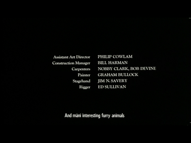
Titles don’t have to be dramatic to capture an audience’s attention. Humour is an incredibly effective, if seldom used, technique to spice up a seemingly boring credits sequence. The titles for the Monty Python troupe’s first feature film Monty Python & The Holy Grail is one such sequence that’ll have you rolling in the aisles with laughter before you’ve even seen a frame of live-action footage. Opening like a somber and important European arthouse film, complete with Swedish subtitles, things quickly start to go (in proper Python fashion) out of control as the subtitles turn into a brochure for Sweden’s tourism department and in-fighting starts happening as members of the crew are hired and fired during the course of the sequence. Hilarity ensues at this link.
NORTH BY NORTHWEST
Between the 1950’s and the 1980’s, one graphic designer dominated the film, entertainment and corporate industry like nobody else could: Saul Bass. A man who almost revolutionized the graphic design industry into an art form and, in the process, revolutionized title sequences into avante garde precursors of what they are today. Among the many filmmakers that Bass teamed up with as an art director and graphic designer was Alfred Hitchcock and played a hand in designing some of Hitch’s most famous title sequences and reputedly storyboarded and co-edited the infamous shower murder in Psycho. Here, Bass brings a touch of grandiose scale set against Bernard Hermann’s awesome score for the opening sequence of North By Northwest, Hitchcock’s blockbuster comedic thriller. Using blue-print like convergence lines to set the logo of the film which eventually dissolves into the facade of the United Nations building, Bass’s opening is unforgettable and etches immediately into the back of your mind. Look out for a cameo by Hitchcock himself as he just misses the bus at the end! You can find the titles here.
GOLDFINGER

Following on from Saul Bass, the other man who influenced title sequence forever was the great photographer and art director Maurice Binder who was responsible for the titles of 14 James Bond films from Dr No (1962) till License To Kill (1989). Binder’s initial foray was designing animated titles for the first two James Bond films, but with the third – and arguably greatest – Sean Connery outing in Goldfinger, Binder set a precedent and movie history with the clever idea to project images and titles onto the body of a female model covered in gold paint. Though it is arguable that Binder’s best work exists in future films like Barberella or The Last Emperor, Goldfinger remains the classic and spell-binding title sequence that started it all. You can experience the touch of Goldfinger here.
LORD OF WAR

Hollywood-based New Zealand writer/director Andrew Nichols is reknowned for serving up fairly cerebral fair and the case appears to be the same for his film Lord Of War, an expose into the world of international arms dealing. The film opens up with an exquisitely poignant sequence that shows the life of a bullet from its origins in an American factory to its journey across the world as it’s resold from country to country until it finds itself in the middle of a war-torn African country where it embeds itself into the skull of a young boy. Set to the haunting strains of Buffalo Springfield’s famous anti-war ballad “For What It’s Worth”, the sequence is a potent and engaging way to open a film that keeps the audience’s interest up and ensures you’re sitting up and paying attention by the time the credits end and the movie properly begins. Check out the video for yourself.
ZOMBIELAND
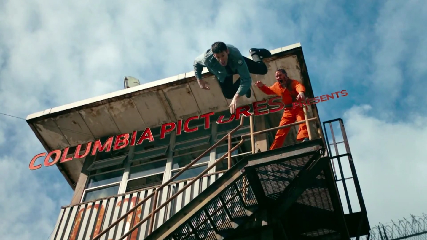
Another modern credit-sequence classic, this one (like the opening of Watchmen) going viral on YouTube as pirate copies became available, the titles for Zombieland belie the horrors of a zombie apocalypse and the wry sense of black comedy and tongue-in-cheek humor that will be served up to the audience for the remainder of the movie. Shot using high-speed digital cameras and incorporating an onslaught of bloody, but whimsical, visual gags and comedy, all set to the bleak and epic tones of Metallica’s classic “For Whom The Bell Tolls”, this is a perfect example of how to kick off a film in the absolute highest gear possible. Clever, fun, grotesque and horrifying, click here to visit the hilarious horror that is Zombieland.
THE SHINING

There is something to be said about simplicity and nobody made simplicity look and feel more complex and powerful than Stanley Kubrick. Fickle, stubborn and an immovable perfectionist, every moment of this memorable title sequence is deliberately constructed to make you feel or think of something as Kubrick turns spectacular scenery of the Canadian Rockies into a creepy and foreboding overture of the death and mayhem that is to follow. Just as he was the first mainstream filmmaker to use the Steadicam in this film, Kubrick also commissioned aerial helicopter footage for this opening perhaps to foreshadow the technically advanced cinematic style that the remainder of the movie will feature. Weird, kooky and a bit unsettling with Wendy Carlos’ attention-grabbing synth music, the credits to The Shining may be the most unusual title sequence you’ll ever see for a horror movie, but one that you will almost never forget. The full opening titles can be found here.
ED WOOD
For our final entry, we return to Tim Burton with this classic, whimsical and undeniably Burton-esque opening credits for his celebrated and charming biopic of the world’s worst movie director Ed Wood Jr. This sequence is humor and in-jokes galore, opening up with a fantastic parody of the opening of Ed Wood’s Night Of The Ghouls, but this time The Amazing Criswell rises up from his coffin to introduce the audience to Tim Burton’s movie. After this we’re subjected to a juxtaposition of iconic Hollywood images: palm trees and Ed’s name in the Hollywood Sign font, but set to the creaky and kooky theremin music of 1950’s horror. After that we see a miniature recreation of the graveyard and flying saucers from Plan 9 From Outer Space and the tentacles of the giant octopus from Bride Of The Monster among many other sight-gags and in-jokes that Ed Wood fans would immediately recognize. If some title sequences introduce or setup or hint at a film that is coming, the credits for Tim Burton’s Ed Wood is nothing less than a pure celebration of its subject matter; sweet and endearing homage for fans and newbies alike. Click here to check out the sequence in glorious black & white!
If you enjoyed this ramble through the world of opening titles, then you may enjoy the following websites devote to the art of movie credits:
http://www.watchthetitles.com/
Other titles that you should check out include the opening sequences for Coraline, Forrest Gump, Lolita, The Ward, Once Upon A Time In The West, Sphere, The Fall, The Kingdom, The Rocky Horror Picture Show and Soylent Green.
Thanks for reading and please remember to click on LIKE below if you enjoyed this article!


