The many ways Zack Snyder’s Justice League improves upon the original
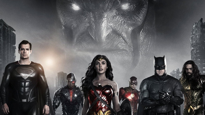
Zack Snyder’s Justice League makes its way to screens here on March 18 when it streams on Neon. Having just seen the film, Dominic Corry lists the improvements the Snyder Cut holds over the 2017 release.
In an attempt to describe the unique level of excitement offered by the prospect of watching Zack Snyder’s Justice League, a de-tooling of a re-tooling, I find myself thinking back to the halcyon days of the video store.
Sometimes, when a TV mini-series was released on VHS, they would put it across two videotapes packaged inside a double-wide plastic cover. It gave the release a sense of specialness that made it seem like more of an occasion than your average video offering, yet still somehow not quite a full new movie.
See also:
* Everything new coming to Neon
* All new streaming movies & series
That’s how Zack Snyder’s Justice League felt to me ahead of time—exceptional on some level, but still not quite a new movie.
At the risk of lumping myself in with edgelords the world over, I consider myself a fan of Zack Snyder’s aesthetic in general. I liked Man of Steel, which I saw as a flawed but undeniably spectacular film. I disliked how Batman V Superman descended into a big-budget ode to rubble, but held out hope for Justice League, a Frankenstein of a movie if ever there was one which ended up being even more rubble-centric than B v S. Why is there so much rubble in these movies?
The first thing that struck me when I sat down to watch Zack Snyder’s Justice League was the 4:3 aspect ratio, the news of which had somehow passed me by. I thought there was something wrong with my screener link. A quick google revealed that Snyder planned to release his film in this box-ish format and that he had cited the “verticality” of superheroes as a partial justification for it.
It’s probably the boldest thing about the Snyder Cut, and I have to say, although it took me a minute, I came to really appreciate it. Snyder isn’t wrong about the shape of superheroes and how they stand, and the framing here evokes comic books in a pleasing manner. A larger TV is helpful in this regard, and I would be curious to watch the film play out on an IMAX screen, which doesn’t currently appear to be an option.
As the film progressed, I found myself enjoying it. Quite a bit. But it was difficult to know how much that enjoyment was influenced by my memories of how awful the 2017 version was, or if the new cut is simply a good film in its own right.
It’s definitely a step up from B v S, and feels epic and grand in ways I wanted it to be.
There is a tonal and aesthetic consistency to the Snyder Cut that was entirely missing from the 2017 version. The individual character motivations, especially Cyborg and Flash, get a lot more time devoted to them, and the overall film is better for it. The lighting is cooler. Cyborg looks cooler. He’s not as cheap-looking. He’s looks less shiny.
The action is fantastic. Although many of the set-pieces were present in the 2017 film, they have been enhanced with extra scenes and a general overlaying of the Snyder aesthetic. This especially benefits the Themyscira stuff, during which villain Steppenwolf throws a horse more than once. Say what you will about Snyder, but the man can stage an action scene.
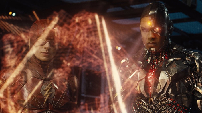
Although I was initially concerned about him being too shiny, the redesigned Steppenwolf makes for a more interesting villain in this cut, now that he is serving a master, Darkseid, whose limited appearances carry weight. Although Thanos made it to the big screen first, the Marvel character is famously (amongst nerds like me, at least) a rip-off of Darkseid, one of comic book titan Jack Kirby’s most iconic creations. That the Darkseid of this movie doesn’t feel like a Thanos re-tread is an achievement in itself. Worth noting: when Darkseid first comes to Earth during an epic flashback sequence, he bends down and examines… the rubble.
I was never a fan of Steppenwolf’s minions, the locust-ish parademons, but they’re less annoying and more threatening in this cut.
Sections of the released cut that I presumed were added by Whedon (due to their quippy nature) are present here, showing that Snyder’s vision wasn’t necessarily as dark as the studio’s fears seemed to indicate. It’s often a quite earnest film.
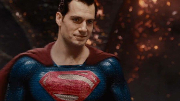
It’s surprising how late Superman comes into the picture, but his presence is highly impactful when he shows up. And I like the black suit. Superman’s presence (or lack thereof) clearly caused much consternation in the rejiggering of the 2017 version (resulting in mustache-gate) and it’s nice to see his arc play out as intended here.
Batman seemed hungover during much of the 2017 version, less so here.
I am a sucker for slow-motion, and Snyder is its biggest proponent since John Woo. There is a lot of slow-mo in this film, and I am here for it.
The final battle here isn’t as dissimilar to the end of the 2017 cut as I had imagined, but it carries with it much more of a purpose and clearer physical dynamics. Rubble has a role to play, but the finalé doesn’t become as nearly rubble-ified as the Whedon cut, thankfully.
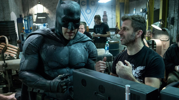
The epilogue is pretty cool, and while the much-hyped cameo isn’t all that mind-blowing, it’s an interesting coda to the story.
It feels obvious (and paradoxical) to say it, but this cut is both surprisingly close to the 2017 version, and amazingly different at the same time. It shows how much the overall feel of a film can be affected by editing decisions. Although both movies have the same general thrust, the Snyder version has a clarity of vision that makes it a much more pleasurable viewing experience.
To resolve my earlier stated conflict, I think this film is pretty choice in its own right, not just in comparison to the terribleness of the 2017 cut. But that definitely helps. Please don’t call me an edgelord.
